
Wedding Colors: How to Choose a Palette You’ll Still Love in 10 Years
If you’re getting married in the Sierra Foothills (hello, vineyard views and that “why is the sunset so rude?” golden hour), your wedding colors have a built-in advantage: nature already did half the design work. Your job is to choose colors that match your vibe, photograph well, and play nicely with the venue—without spiraling into 47 saved palettes and a mild eye twitch.
Quick Answers (save this for later)
Start with the venue + season: let the landscape (vines, barrel room, ceremony lawn) lead the way.
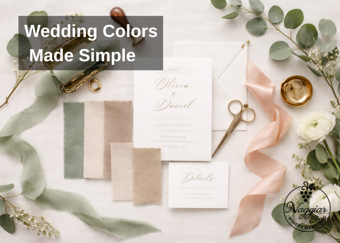
Pick 1–2 main colors + 1 neutral + 1 metal (gold/brass or silver) for an easy, cohesive look.
Test your palette in photos: daylight + sunset + indoor lighting (barrel rooms are moody in a good way).
Use color in layers: bridesmaids + florals + linens + paper goods—no need to color-bomb everything.
Step 1: Decide the “vibe” in one sentence
Before you pick colors, name the feeling. Not a 10-paragraph mood board dissertation—one sentence.
Examples:
“Romantic vineyard dinner party.”
“Modern, clean, and airy.”
“Tuscan-ish winery weekend (but in Northern California).”
“Wildflowers, but make it intentional.”
That sentence becomes your filter. If a color doesn’t support the vibe, it doesn’t make the cut (looking at you, neon teal).
Step 2: Let your venue do the heavy lifting
Winery venues bring strong visual elements: estate vines, wood tones, stone, greenery, and often warm light. That means:
Earth tones and soft neutrals look expensive (in photos and real life).
Highly saturated brights can feel chaotic against vines and rustic textures unless carefully balanced.
Barrel rooms love warm palettes: creams, terracotta, rust, deep green, burgundy, black accents.
Want to see how palettes show up in real winery light? Browse the real wedding inspiration in the gallery.
Venue-friendly neutrals to anchor your palette:
Ivory / cream
Champagne / sand
Warm taupe
Soft gray (use sparingly in warm settings)
Matte black (modern contrast)
Step 3: Choose your base formula (the no-regret method)
A palette doesn’t need 9 colors and a manifesto. Try this simple structure:
The 4-part palette
Main color (the star)
Secondary color (supports the star)
Neutral (keeps everything from screaming)
Metallic (adds polish)
Example formulas that work especially well for vineyard weddings:
Sage + ivory + brass + soft blush accents
Navy + cream + gold + eucalyptus green
Terracotta + sand + copper + deep olive
Black + white + champagne + muted rose
Burgundy + blush + ivory + antique gold
Pro tip: If you’re drawn to multiple palettes, keep the neutral consistent and swap the accent colors seasonally.
Step 4: Match colors to the season (and Northern California light)
In Nevada County / Grass Valley and nearby areas like Nevada City and Auburn, seasonal light changes your photos more than you think. Here’s the easiest way to align your colors with nature.
Spring (fresh + soft)
Sage, blush, dusty blue, ivory, light lavender
Florals can do more of the color work here—keep linens neutral.
Summer (bright but controlled)
Olive, cream, terracotta, peach, muted coral
If you want bold, pick one bold color and calm it with neutrals.
Fall (your winery palette era)
Rust, burgundy, ochre, deep green, champagne
This is peak “barrel room + candlelight” territory.
Winter (moody + elegant)
Evergreen, black, plum, navy, metallics
Texture matters: velvet ribbons, matte paper, glossy glass.
Step 5: Think in “layers,” not “matching”
Matching everything is how you end up with bridesmaids, napkins, and flowers all fighting for attention.
Instead, assign colors by category:
Where to put your main color (choose 1–2):
Bridesmaids dresses or bouquet florals
Statement napkins or ceremony florals
Invitations or signage accents
Where neutrals shine:
Linens, chairs, plates, table runners
Groom + groomsmen accessories (ties/pocket squares)
Ceremony seating and altar details
Where metallics work best:
Flatware, candle holders, frames, table numbers
Wax seals, invitation foil, signage hardware
This approach keeps your palette cohesive and interesting.
Step 6: Make sure it photographs well
Here’s the truth: some colors are gorgeous in person and weird in photos (or vice versa). Before you commit:
Compare your palette against greenery (vines are their own strong “color”).
Test under midday sun and golden hour.
If you’re using indoor spaces, test under warm lighting too.
Colors that usually photograph beautifully at winery venues:
Ivory, champagne, blush, terracotta, sage, olive, navy, burgundy
Colors that need more care:Neon/brights, icy cool grays, very pale pastels (can wash out), stark pure white against warm light
Step 7: Keep guest experience in mind (yes, really)
Your colors influence more than aesthetics:
Dark palettes + outdoor summer heat = guests in black suits quietly melting.
Ultra-light palettes + red wine =… risky choices were made.
High-contrast modern palettes look amazing but benefit from clear signage and consistent details.
If you’re planning something intimate (and want colors to feel elevated without extra décor), micro weddings are basically made for a refined palette and great lighting.
Easy winery-ready palettes (steal these)
Pick one and move on with your life (you have cake to taste).
Sage + Ivory + Brass (timeless vineyard romance)
Terracotta + Sand + Olive (warm, earthy, sunset-friendly)
Navy + Cream + Gold (classic, formal, photographs like a dream)
Burgundy + Blush + Champagne (fall winery perfection)
Black + Ivory + Greenery (modern + clean with vineyard texture)
Want help aligning a palette with your date, lighting, and spaces? You can also peek at package details and what’s included here.
Bring it all together: your 15-minute color decision checklist
Write your one-sentence vibe
Choose main + secondary + neutral + metal
Test against greenery + wood tones
Decide where your main color shows up (2 places max)
Keep linens neutral, add color with florals + paper
Confirm it works for both ceremony + reception spaces
When you’re ready to talk dates, layout, and how your palette will look in real winery light, reach out here.
Pro Tips
If you can’t decide, pick your neutral first (ivory/champagne) and build around it.
Use one bold accent max (like burgundy napkins or coral florals), then calm everything else down.
Repeat colors at least 3 times across the day (paper goods → florals → tables) for cohesion.
Common Mistakes
Choosing colors from a screen only—always test in natural light.
Matching everything exactly (it reads flat). Aim for tones (sage, olive, deep green) instead.
Ignoring the venue palette (wood, stone, greenery). The venue will win.
FAQs
Q1: How many wedding colors should I choose?
A: Aim for 3–4 total: 1–2 main colors, 1 neutral, and 1 metallic. It’s cohesive without being chaotic.
Q2: What wedding colors work best for a winery wedding?
A: Winery settings love earth tones and warm neutrals—sage, olive, terracotta, blush, champagne, navy, burgundy—plus brass or gold.
Q3: How do I choose wedding colors that photograph well?
A: Test your palette in daylight and golden hour, and check how it looks next to greenery. Avoid ultra-pale pastels that can wash out.
Q4: Can I use black for a vineyard wedding?
A: Yes—black looks stunning when softened with ivory/champagne and natural greenery. Add a warm metallic to keep it from feeling stark.
Q5: Should bridesmaids match the wedding colors exactly?
A: Not necessary. Pick a color family (like “greens”) and use multiple tones for a modern, photo-friendly look.